Asics Corporate Logo
Apparel Brand Redesign
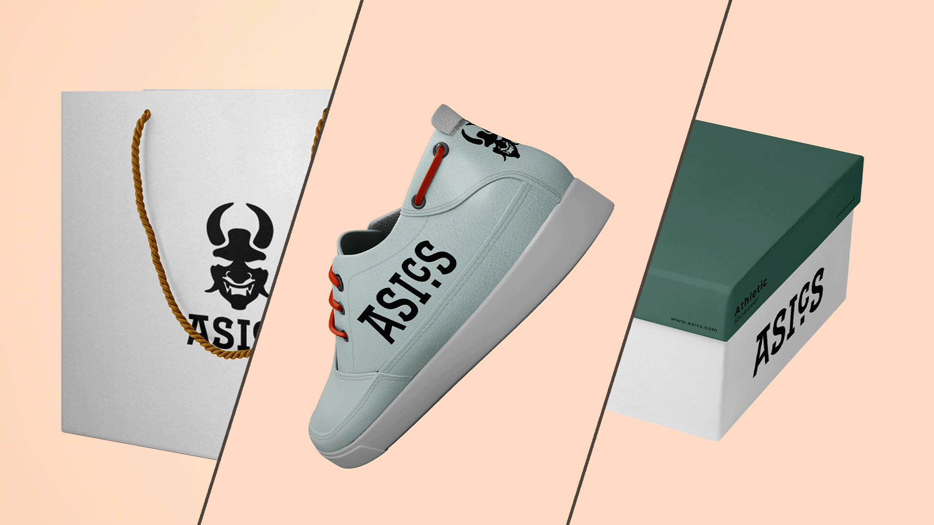
For Asics Logo, I was tasked with creating a distinct, memorable, scalable, and appropriate logo for a corporation of my choice. The corporation I chose was Asics, not because I believed that their logo needed to be redesigned but for the fact growing up I read their brand as “Oasics”. The logo that comes before the word “asics” had misguided my idea of the brand for years.
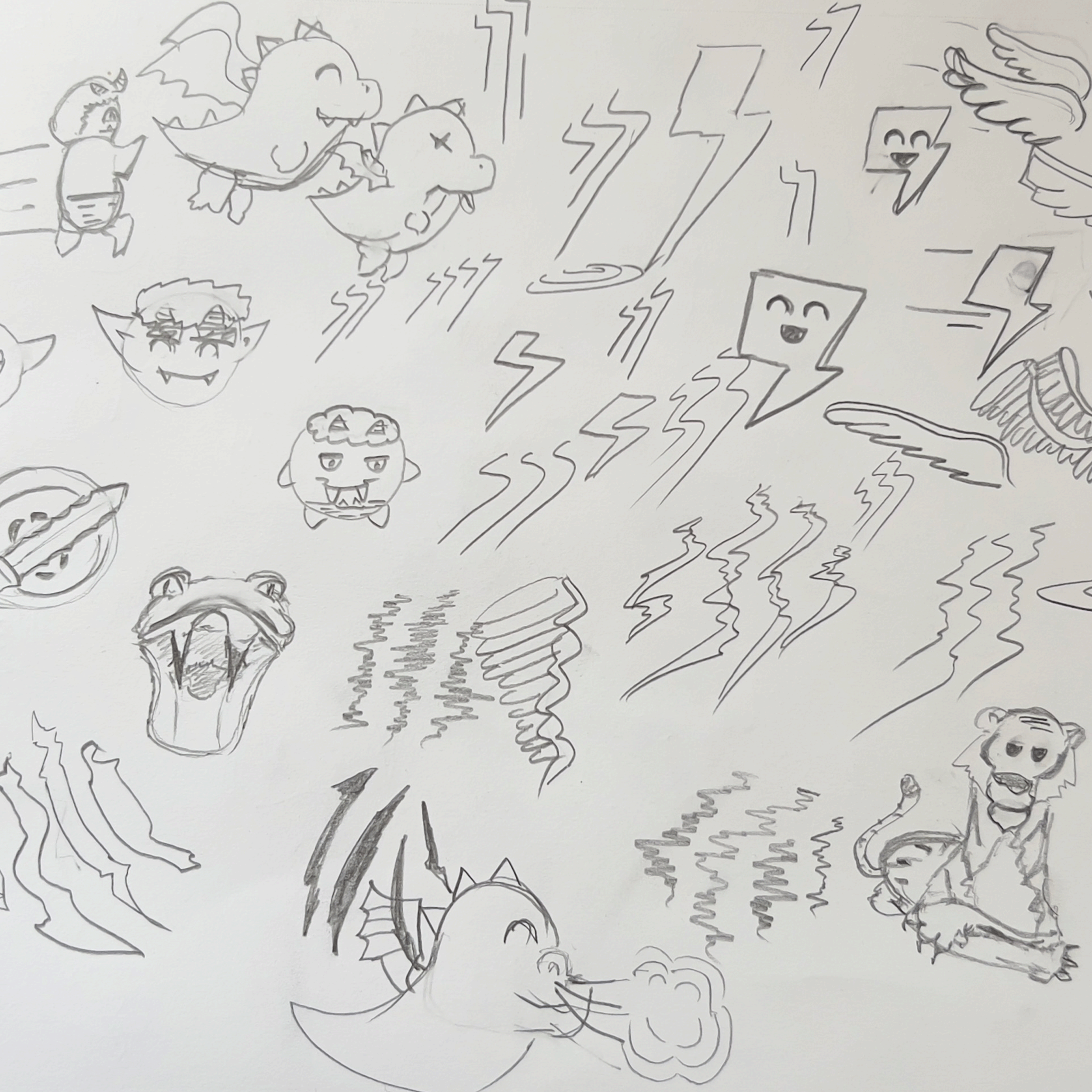
Asics is an athletic sports manufacturer whose message contributes to nurturing youth and the development of society. Founded in 1949 on the philosophy of “ANIMA SANA IN CORPORE SANO (ASICS) — A Sound Mind, in A Sound Body, meant to inspire people around the world to live healthful, happy lives both physically and mentally. From this several ideas emerged like agility, fierceness, and Japanese folklore surrounding the elements.
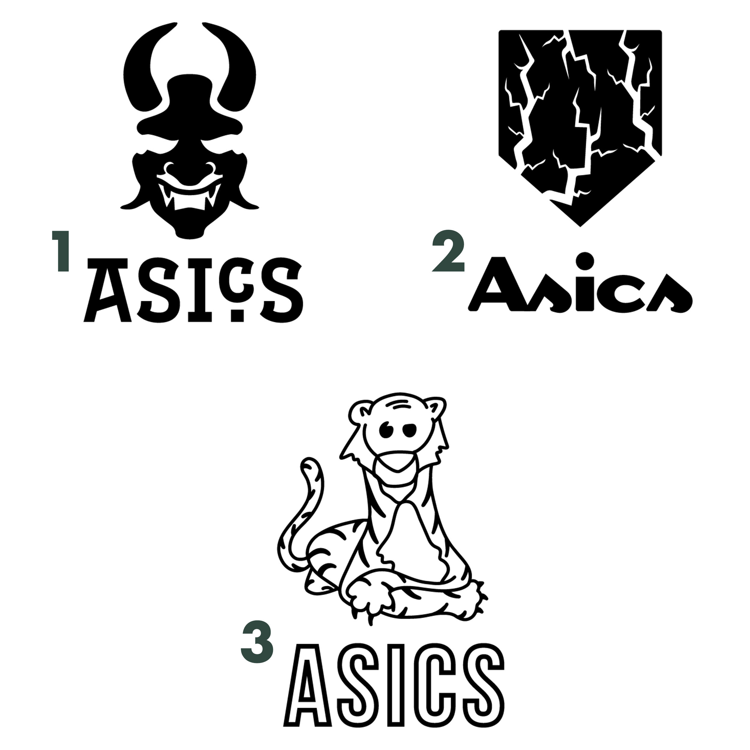
The three logos up for consideration for the final logo were:
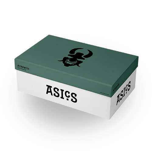
1. Raijin Oni Mask. Inspired by the Storm God from Japanese mythology best known for the fierce sounds of his thunderous drums, representing the bold speed of sound.
2. Lightning Tiger Scratches. Inspired by a combination of lightning and a tiger claw scratch, representing the fast pace & competitive nature of sports and athleticism.
3. Songs The Tiger. Inspired by the natural pride displayed by tigers, representing confidence at its finest.
The final logo that reigned supreme out of the three was the Raijin Oni Mask logo. I felt it was the appropriate choice for the Asics brand and mission, this modern spin on “faster than the speed of sounds” symbolism delivers on the message of living life freely both physically and mentally.
Client | Insctructor Emily Moody
Service | Visual Identity Design, Graphic
Design
Skills | Adobe InDesign, Adobe Photoshop
