Piko
The Island Sustainability Learning Experience App.
Preservation of culture and land through respectful ʻāina friendly choices.
Project Overview
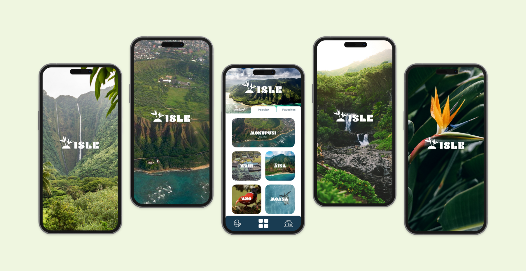
Design a mobile app focused on cultural island life sustainability and influencing friendly choices to protect and perpetuate island culture. The goal was to develop a visually appealing and effective system to convey the core values of the app.
Services
UX/UI & Mobile App Design
Software
Adobe Creative Cloud: Illustrator, PhotoShop, Dimensions, Blender, HTML, CSS, and Javascript Library

Challenge
Create a visually engaging and user-friendly app that lends to both native and non-native culture that included staying to true to the language of ‘Ōlelo Hawai‘i. How can two cultures co-exist under one UX/UI hood?
Solution
Design a mobile app that resonates with and represents the preservation and perpetuation of Native Hawaiian culture.
Conceptual Planning
Formulating this complex system began with a user flowchart, explaining how one would navigate through the app. The focus was to create an inviting yet visually engaging and user-friendly interface that could help users learn about and sustain the culture of the island. To this end, we designed a colorful and inviting UI with bold typography and clear navigation. We also used a mixture of traditional and modern design elements to reflect the island‘s history and culture.
Logo
The word Piko when translated from Hawaiian to English has two meanings. The first meaning is related to birth and the navel. The second meaning correlates to the top of something like a summit of hill top. It was without a doubt that this name belonged and add to the story of the identity of this platform. Here you have the beginning or start to ones path that leads to the top or goals of ones journey.
Color Palette
The color palette focused on two primary colors green and yellow. Green symbolizing growth, balance, and youthfulness. Yellow symbolizing optimism, joy, and friendship. The Secondary blend of neutral colors allows the primary colors to shine.
Typography
Mrs Eaves XL Serif OT is of the serif type family. It features displayed a nuance of elegance and refinement, it was chosen because itʻs friendly yet clear. ITC Avant Garde Gothic Pro is a geometric sans-serif typeface with a quieter tone and welcoming curves. It was importance to come across with as much clarity needed but at the same time stay playful and fun.
Pattern
Inspired from a traditional form of storytelling, using a triangle to form a motif to create a visual band and cut out of mountains tops enhances the visual appeal of the site. The combination of cultural reference, definition, and representation was the end result of this pattern.
See more work
